
Donate buttons are a crucial part of your fundraising strategy, driving conversions on your nonprofit organization’s website.
Whether you incorporate donate buttons into your virtual fundraising forms and emails or as a simple call to action throughout your online and social assets, this guide will help you create a donate button that stands out and helps your organization raise the funds it needs to succeed.
FAQ about the basics of donate buttons
Understanding the fundamentals of donate buttons and what makes people click on them will help you design one that fits your site and converts donors.
What is a donation button?
A donation button, or donate button, is a clickable element on a website page that leads your viewer to another page where they can make a donation to your organization.
Why should my nonprofit add a donate button to its website?
As your audience views your website pages or reads your emails, they learn more about your organization and purpose. Examples of how your nonprofit helps its audience through impact stories will help convince those viewers that your organization is worthy of their donation.
Donate buttons used in convenient and highly visible locations guide your audience to the place where they can finalize their online donation.
What should my donation button say?
Donate buttons can be simple buttons with just text or banners with images or icons. The text you use should be concise to optimize the button for mobile devices where many visitors will make their donations.
Popular options for the text of your donation button include:
- Donate
- Make a Donation
- Donate Now
- Donate Today
- Give Now
Additionally, you can add graphics and icons to help your donation button stand out. You can add icons showing:
- Thumbs up
- Checkmarks
- Chevrons or directional arrows
- Dollar signs
- Credit cards
Featuring the right visual elements can help catch prospects’ eyes, which may inspire them to click through to your donation page.
Where do you put a donate button on a website?
Donate buttons can be easily embedded into your site with the right fundraising tools and are a good fit on nearly any of your website’s pages.
There are a few places where they work particularly well. Your menu, which contains your organization’s logo and your website’s most important page links, is usually the first thing people see when visiting your online hub. Placing a donation button in your menu is a smart idea, especially if your menu sticks to the top of the browser window making it ever-present while your donors browse your site.
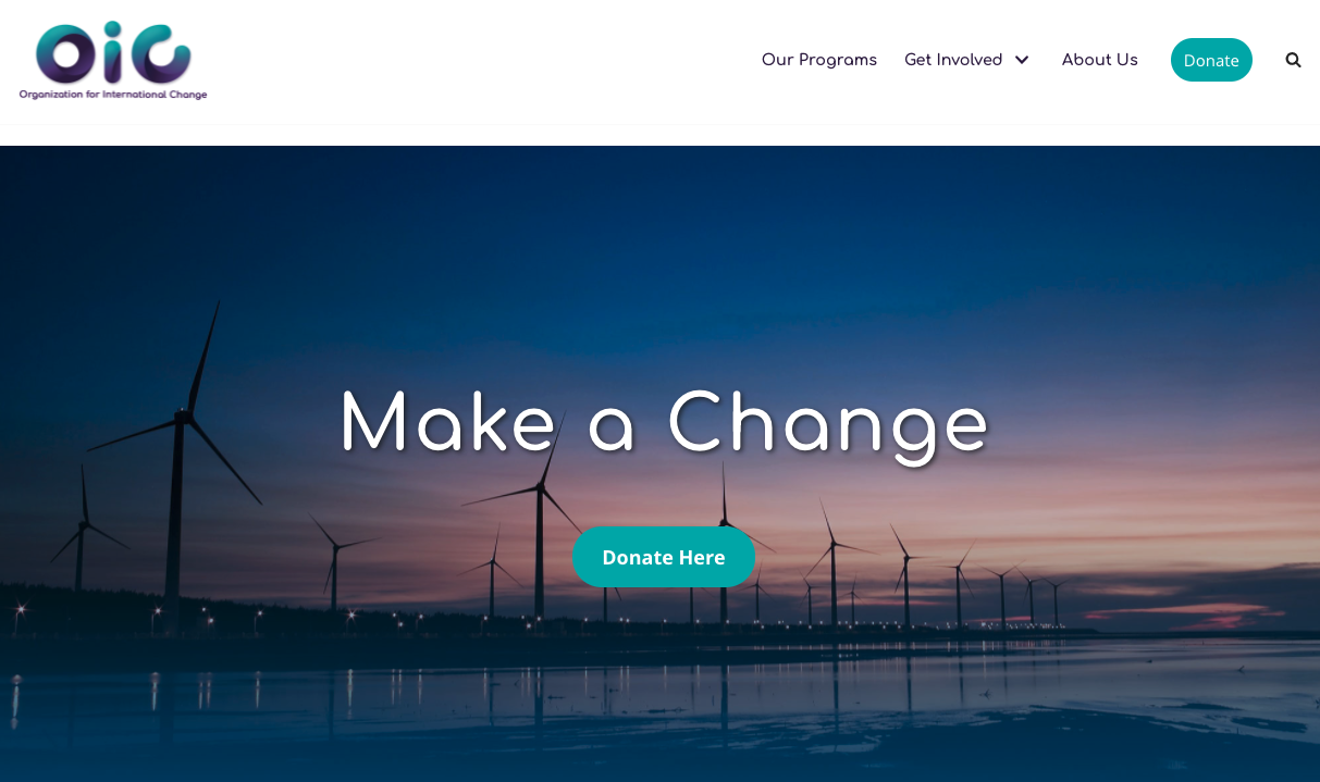
Another great area for your donate button is under the menu on the homepage in an area called the hero. The hero area typically features a large, high-resolution image that is contextually relevant to what your organization does. Having your donate button featured prominently on your site will help drive conversions for those people who visit your site specifically to donate.
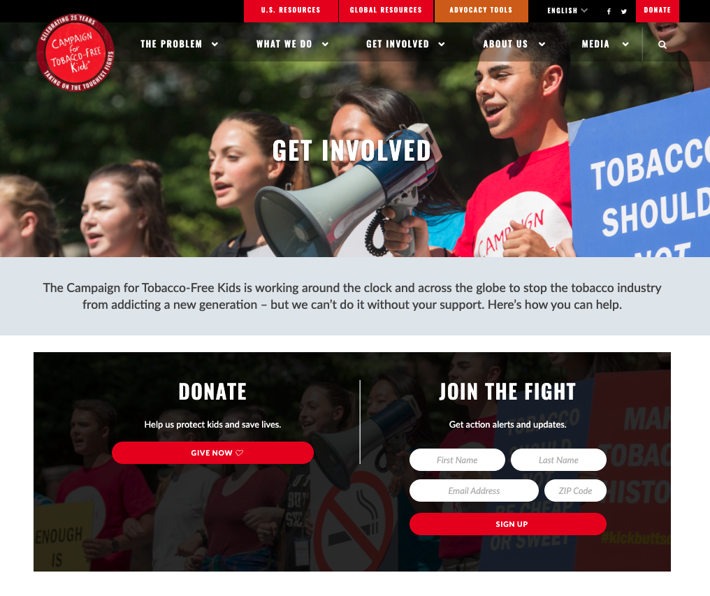
It’s always a good idea to put your donate button in areas that are likely to get high traffic. Some organizations put their donate button on their “Get Involved” page to grab the attention of those who are looking for ways to give back.
Remember, any place where you are likely to get traffic on your website is a good place to feature a donate button. This is especially true when you are telling stories that elicit emotion and increase your readers’ likelihood to donate.
Best practices to make your donate button stand out
Optimizing your donate buttons will convert more visitors into donors and help increase your fundraising. Here are a few best practices you can employ to make your donate buttons stand out and grab attention:
- Button color: Keep your button color consistent with your overall website theme, but make it stand out against its background.
- Button shape: Again, tap into your existing theme. If you use round radius buttons elsewhere on the site, your donate buttons should use the same radius to be consistent.
- Button size: Your button should be big enough to fit the text with a little bit of padding to make it easy to read. Keep in mind that your button should look as good on mobile devices as it does on desktops. As the viewer’s screen size shrinks, smaller buttons can be replaced with full-width buttons on mobile phones.
- Button font size: It should be at least as big as the body text around the button, if not a few points bigger. If you’re using 16pt font for your normal text, your button text should be 16pt or 18pt. You can also bold the text to draw more attention to it.
- Button font color: Your donate button text should stand out on top of the button. If you’re using a button with a solid background color, white or black button text works well. If you’re using a white or transparent background button, you can use a button text color that is complimentary with your theme.
Spending time optimizing these elements of your donate button will be well worth the effort in attracting more donors and making conversions.
Best examples of donate buttons to model yours after
Let’s take a look at a few examples from leading organizations about how to make your donate button as effective as possible.
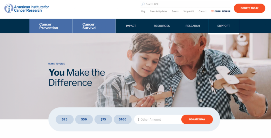
American Institute for Cancer Research
American Institute for Cancer Research features a beautifully designed donation button on their homepage that fits their theme that includes suggested giving amounts and a place where the donor can enter a custom amount too.
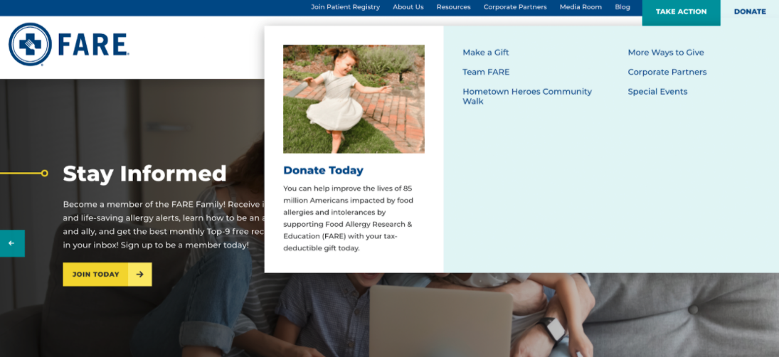
Food Allergy
FARE uses a donate button in their menu which, when hovered over, opens a submenu with several donation options for the viewer to choose from. Giving donors options lets them exercise control over how their funds are directed.
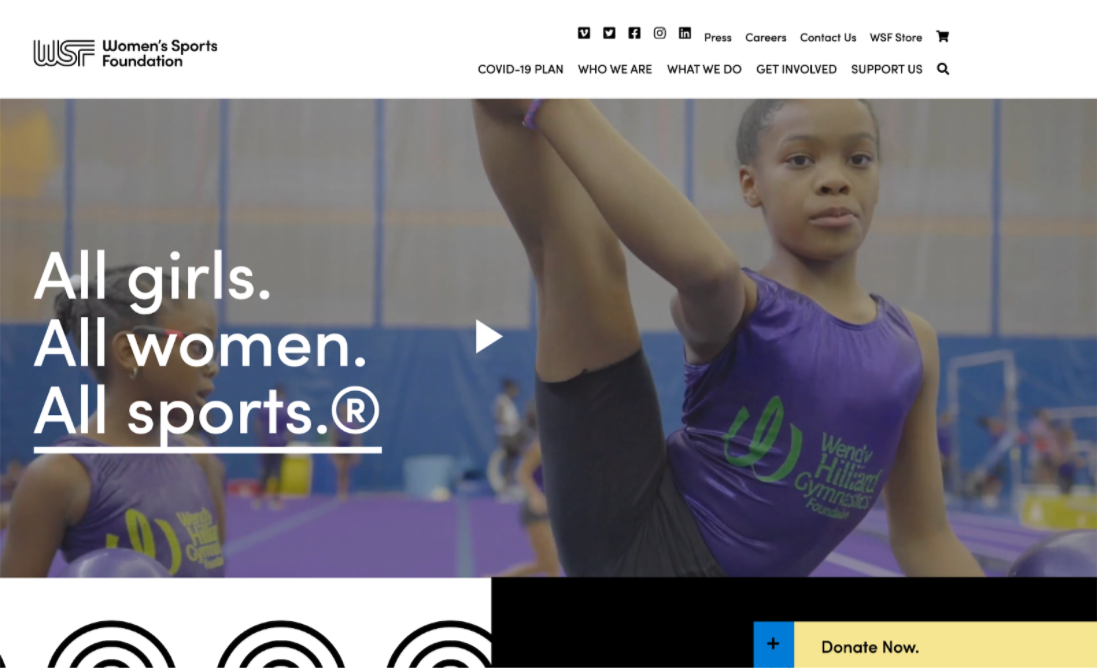
Women’s Sports Foundation
The Women’s Sports Foundation uses a donation button that floats on the bottom of the web window and stays there as the viewer browses their site, making the button ever-present and easy to access.
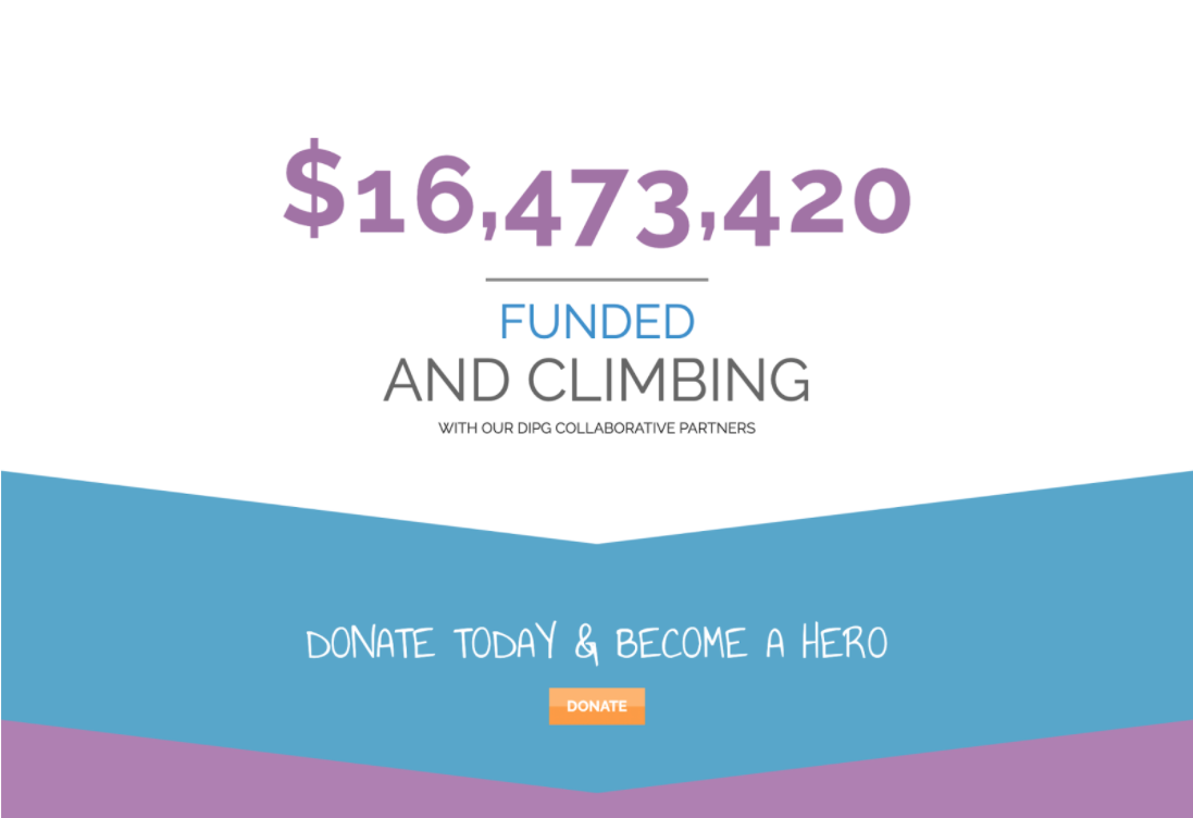
The Cure Starts Now
The Cure Starts Now, an organization fighting pediatric cancer, features colorful infographics and impact statistics on its homepage to direct the viewer’s eye into a funnel that leads right to their donate button.
Add a donation button to your website today
Donate buttons are an essential part of every nonprofit’s fundraising strategy and can complement your design to drive engagement and help you accomplish your fundraising goals.